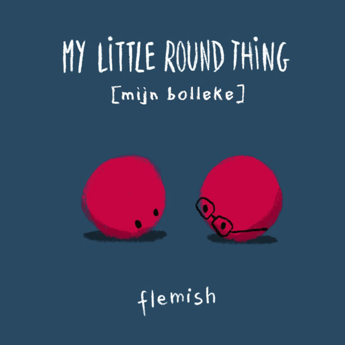
So today, via Language Nerds‘ blog, I discovered that the Flemish for “little round thing” is bolleke, used there allegedly, as a term of endearment. The original posting was on Skyparksecure.
The definition is backed by De Koninck, whose many fine beverages I’ve enjoyed on trips through Europe. Here they’re referring to the shape of the glass it is served in (every Belgian beer has its own glass shape to allow the beer to be enjoyed at its best).
In Middle English, bollocks came specifically to mean testicles, likely by borrowing the generic “ball-shape” word from Flemish traders.
In more modern parlance it has come to additionally mean rubbish, or “unsubstantiated opinion that the utterer suspects as invalid”… the prior assertion of the word’s origin being just that.
As in many cases of English vernacular, it can also be used in the opposite, as a great complement, particularly when used in the context of canine genitalia. There are few complements higher than something being declared “the dog’s bollocks“. Oddly, though, this is originally an editorial term from newspapers, used to describe the now rarely seen opening introduction to a list “:-“.
Some are good habits, like automatically washing your hands when you’ve been to the loo or, just as importantly – in the COVID times – as soon as you re-enter your home.
Some are bad habits, like smoking or incessantly tapping on the edge of your desk when you’re working at home (according to the lovely Mrs E.).
The thing habits have in common (unless they’re the scratchy wool kind) is that they’re automatic subconscious actions or processes and very hard to unlearn. No. 3 offspring educated me to the unsupported “fact” that it’s of the order of 3 months to “unlearn” a habit. He read it on the interwebs, so it must be true.
Smokers are often heard stating some variation of “I’m not addicted – I can stop any time I want.” It’s the sufficiently wanting to that is often the crux of the issue, though even with that firmly in one’s sight, a true habit still takes much breaking and all too often is readily reacquired. The share-holders of Weight Watchers International bank on it in fact. Literally.
So – enter fountain pens. As a school kid somehow earning a local government scholarship to a grammar school (now a private school beyond the reach of many – yay capitalism), I was required to use a fountain pen. A few came and went – either through the natural rigours of teenage schooling, or occasionally from poor manufacture (looking at you Platignum… just sayin’).
As I grew older though, and entered the sixth form, I acquired a “proper” pen – a Parker 45 – and that saw me through the rest of my formal educational years including university. Being subsequently employed in the newly minted dark arts of computer programming (AKA “the 80’s” for those studying modern history) I had less and less need of an analogue writing stick.
I did occasionally reach for a disposable fountain pen – mainly for the chance to use outlandish colours like green or purple. These were still the days of sedentary Blue/Black Quink ink for fountain pens, but the wily Japanese were busily cross pollinating what they’d learnt from gel pens into more exciting alternatives (if not entirely environmentally sound ones) for fountain pens. It was literally decades before I realised one could refill/reuse a “disposable” fountain pen.
Then the years passed, as they always have. Mortgages got signed. Children got born. Continents got moved. Not in the tectonic way (though that happened a bit too), but in the BA flight 85 kind of way. Somewhere along the passage of time my wonderful father-in-law bought me a new fountain pen (Sheaffer Sagaris), which I religiously used every day for work notes.
Recently, COVID entered our vocabulary, and in a lot of tragic cases, our lives.
Working from home happened.
Profound grumpiness occurred.
A chance re-discovery of my old Parker 45 at the back of a drawer also occurred (distractions had been actively sought… even to the extent of tidying rarely visited backwaters of the newly emptied nest). This was pivotal. I now had TWO fountain pens at the same time. Two is a collection. So is more than two, it turned out. That was 18 months ago.
Today I have around 60 fountain pens. Some are relatively expensive ($250 in my case – though for some collectors that counts merely as entry level), but most are not. I do however use all of them, though obviously not all at the same time!
That many pens could consume a lot of ink, you might think. Well… let’s just say I have that covered too.
But of course if you’ve got a lot of pens and a lot of ink to go in the pens, you’d need a lot of paper to write on wouldn’t you? Well… so you’re getting the idea now why this began as a piece on addiction?
But I’m getting better. Honest I am.
I try not to buy pens now just because I like the look of them. I try and leave those for my family to get for birthdays and Christmas. But it’s not perfect. Without meaning to trivialise the situation of any reader struggling with a health-impacting addiction, I am, nevertheless still drawn to the “add to cart” button on many stationery web sites.
I try very hard to limit myself to one new pen a month, and thankfully my tastes are rarely expensive. But all-metal pens (what Parker terms “Flighter”), or all black pens (AKA “stealth”, especially if the nib itself is coated black) are a particular weakness.
In October, I read the often informative “mnmlscholar” blog, and he described a new pen he’d just acquired. This was the Jinhao 9035, a mid-sized pen made of wood. Neither stealth or metal, but… interesting! Jinhao is a Chinese brand, but I have to say that I now own several different models from their stable, and have found the ones I have acquired to be very well made and reliable. I do tend to go for their metal bodied options which may improve the leeway for higher build quality, but I also own no less than four of their 992 model which are clear plastic and just as reliable.
Whilst innocently investigating the 9035 pen on AliExpress, I discovered another new-to-me Jinhao model, the “Stealth” styled Jinhao 95. The pair of them came to a little over $12 shipped to Canada, and the compulsion was strong with me that day…
Well that was back in late October 2021, and much has happened since then. Including ordering one of a new 200 pen limited release of an all-copper Italia from Ensso, which may well be documented in a later blog post.
Fast forward 2½ months, and on Friday the Chinese pens appeared in my post box.
Wooden Jinhao 9035 and “Stealth” Jinhao 95
To ease my (not very prominent) guilt a little then, I thought I’d share my early impressions of these newcomers to my collection. Maybe someone will find it useful, and at the very least it’s keeping me out of Mrs E’s way for a while as I write this.
Firstly the Jinhao 9035…
I opted for the walnut finish (on some sellers’ sites it’s referred to as specifically American walnut), though it does seem to be available in rosewood too. I’m no wood expert and can’t really comment, beyond a general statement that it’s a lovely colour and seems well finished with no scratches, gaping “pores” or other irritations. There’s also no evidence of what must surely have been a mechanical turning process, so kudos to the QA folks at Jinhao. It seems well smoothed, but not obviously varnished. It may have been treated with Danish oil or something, but has no obvious smell, and I fully expect it to “weather” as the grease from my fingers impact the wood over time.
As you may be able to see from the photograph above, the cap has a pretty standard Jinhao steel clip. It has a springiness strong enough to cause the ball end (formed from the plate steel) to scratch the wood underneath slightly. The clip is adorned with the company’s logo of a horse and chariot. I note that it is the right way round when the pen is held in the left hand… something I appreciate!
The lip of the cap is protected by a metallic ring, though the cap threads behind it are plastic and are part of the seal lining within the cap to prevent the nib drying out. This extends up to hide the inside fixing of the clip, which enters through a simple well-formed cut in the wooden cap. The metal lip of the cap provides a neat IKEA-style wood/chrome finish to the pen when the cap is closed and the cap extends around the barrel by a good millimetre or so giving a vaguely mushroom appearance when closed.
The business end of the pen is a standard Jinhao No. 6 steel nib, which is marked with a border pattern, their chariot logo, their brand name and a claim of being 18KGP, or 18 karat gold plated (carats are for diamonds if you were wondering).
I’m no metallurgist, so I’ll leave that one just hanging there, but I will say that I have used several of these nibs on Jinhao X750s and even bought the simple nibs to replace other No 6 nibs on Moonman, Noodler’s and Narwhal pens. I find them slightly springy, wet and generous and suit my writing well. I have yet to struggle with a single Jinhao nib – though I do tend to avoid their lower end Lamy knock-offs and most of their plastic offerings. I find these No 6 nibs particularly reliable and though I’m sure statistically there must be some duds out there, I’ve yet to get one that needed anything special before using it “out of the box”.
Though I inked up the pen with Lamy Turmaline before checking (my bad… too excited) I’m pretty sure the nib isn’t in a screw-out nib unit, and would require pulling from the section housing along with the feed. I’ll try and remember to confirm that once I dismantle it for cleaning.
The section itself is a little shy of 2cm in length and is bookended by chromed rings. It’s very similar in style and feel to the X750 section, but not the same. The metal ring at the barrel end of the section hides the join and merges with the threading on the barrel to engage the cap. The cap closes in 1¾ turns for those who are particular about those things. The metal here engages with the aforementioned plastic cap threads and gives a firm closure and no noticeable play in the cap once closed. The threads are square cut and unobtrusive when gripping the pen for writing. They also form a transition to the step-up of the barrel, which might be seen in the above photograph.
The pen comes provided with a standard Jinhao converter. Again – apologies for inking it up before checking whether the nipple is of the narrow or broader “standard”. Though both will take arbitrary International Standard cartridges, there is a little less forgiveness when using a third party converter. I believe the difference is 2.6 mm or 3.4mm. Not a lot, but enough to cause leaks with some converters. Again – I’ll try to remember to update this post when I dismantle the pen.
The collar by which the section screws to the barrel is metal and seems well made with no sharp edges. It is engraved with the brand JINHAO in capitals and model 9035 in italics. The collar is around 12mm in length and securely holds the converter in place. About 5mm of the collar are threads to engage the barrel and are finer than those holding the cap in place.
The wooden barrel itself is unlined, save for the metal insert which is threaded to receive the section and engage with the cap. It seems roomy and well finished on the inside, with no visible splinters or cracks.
All in all, the example I received seems well finished, with no rough edges or bad joints. This has been my typical experience with Jinhao, and I am amazed they can make them for the price they are sold.
I don’t post my pens, but the inner threads of the cap – even though they’re plastic – would not be kind on the wood of the barrel over time, I suspect. I briefly tried though, and the cap seems to be firmly held by the friction, if that’s your thing.
OK, so to illustrate my assertion that I can indeed stop any time I like, I’ll call that it for this post and talk about the Jinhao 95 in a separate outing to the keyboard. Until next time…
Of late, I’ve been trying to use up the many ink samples I’ve acquired over the last year or so. My Kaweco Brass Sport currently has a very rich purple ink by Pure Pens called Flower of Scotland. It’s part of their Celtic collection. It’s manufactured by Diamine and I recommend it wholeheartedly if you like purples. As my mind idly caused words to appear in my journal tonight, I felt these were suitable for duplicating in type in these dubious pages.
Source: Pure Pens
I think this ink would be very apt for some romantic poetry or prose from the Victorian era…
Winstanley slammed the door as he left the library. Emily took her kerchief from her sleeve and dabbed the unbidden wetness from her eye. After a moment to compose herself, she tugged on the bell to summon Higgins.
“Yes Miss?” he enquired as he materialised by the door.
“Higgins – Mr Boothman has decided to leave for town a little earlier than anticipated. Have the car brought round would you?”
“Of course Miss. Will there be anything else?”
“No Higgins. That will be all. Thank-you.”
“Are you sure, Miss?”
“I beg your pardon Higgins? What is this impertinence?”
“My apologies Miss. I did not intend to offend. I merely wondered whether you’d like me to arrange for Mr Boothman to be provided with an opportunity to consider his actions.”
“Higgins, are you suggesting doing Mr Boothman some kind of mischief?”
“Admitting as much would place Miss in a difficult position if enquiries were to be subsequently made by officers of the law Miss, so I shall make no such admission.”
“Very well Higgins. I greatly appreciate your loyalty and flexible honesty. Oh – and Higgins?”
And if my typically obsessive nature plays out as usual: 499 to go.
Let’s back up a bit.
A few weeks ago, I was fortunate enough to find myself in Victoria, the capital of our lovely province of BC, here in Canadiania. Popular legend has it that BC moved its provincial capital from New Westminster on the mainland to Victoria on the island. (Originality wasn’t a strong suit in the days of colonial expansion when it came to naming towns and cities). The supposed reason, if you look at a map, is that Victoria is in the south of the island, and the 49th parallel passes well to its north.
Unthinkable to dispossess the province of its capital, so the Oregon Treaty extension in 1846 to the 1818 convention that negotiated the border betwixt Canada and the former colonies to the south follows the 49th line of latitude only until it gets to the Georgia Strait, then detours to the south, leaving Her Majesty’s island possession whole, to the north. A cute story, but the island colony was only unified with the mainland (i.e. became part of BC) and made into the provincial capital in 1866. True that the island colony’s own capital was still Victoria prior to then… but only from ~1854.
Source: Wikipedia
Further east – well into the mainland and not far from my home in White Rock, there are a couple of square kilometres of peninsula to the south of Tsawwassen called Point Roberts that dip below the 49th, and the US had no qualms about planting their flag on this scrap of land, so I think the reality of the island remaining whole is likely more subtle. Perhaps some more learned visitor to these pages can educate the rest of us further…
Source: Wikipedia – Point Roberts, WA State
So anyway – back from that vaguely meandering history diversion… and we were enjoying a quiet weekend in Victoria. I took the opportunity of visiting Munro’s, the book shop. Well – it would be rude not to really! The store was founded in 1963 by Jim Munro and his first wife Alice Munro… the well known Canadian author. (Echoes of a Monty Python sketch somewhere there!)
I was recently fortunate enough to win a copy of a book from Charlie Rufus’ Indian Marmalade Company blog site. It’s a companion volume to the Grimm TV series (which I’ve been voraciously devouring in typically obsessive mode), which includes a character named Munro also. No relation, I hasten to add. One being literary, the other literature. (Or as I sometimes need to tell Mrs. E when she gets too invested in a TV drama- “it’s not real, you know!”).
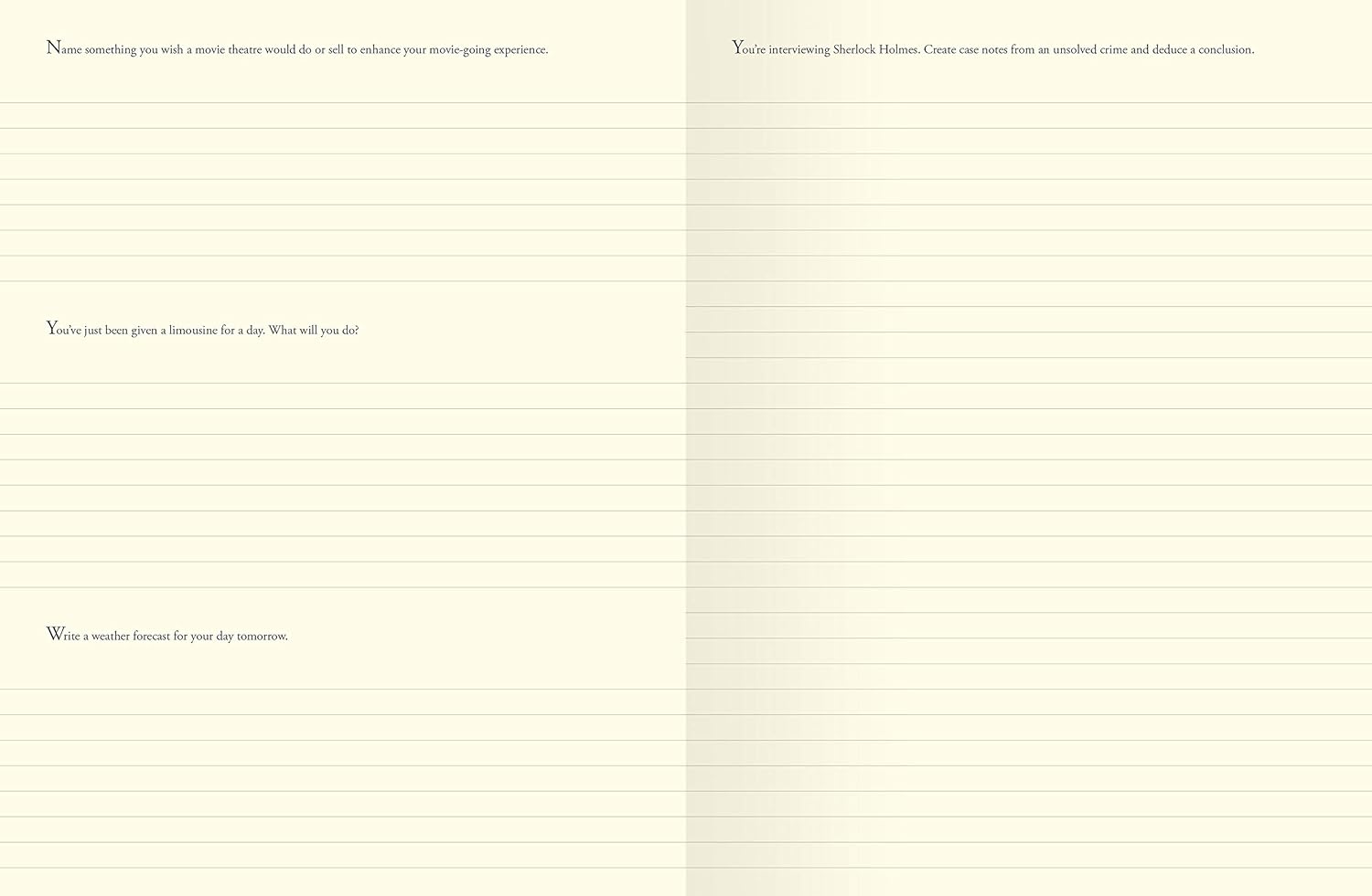
I ended up buying a copy of Marcus Aurelius’ “Mediatations”, admittedly not in the original Latin, but I did also flirt with a copy of 500 Writing Prompts by Piccadilly. I regretted not buying it as soon as the opportunity was no longer possible. Such is life.
Yesterday though – I happened across a copy in my local Indigo bookshop, and this time I didn’t hesitate. The book is essentially an empty journal of “toothy” paper with writing prompts to encourage creative thought. 500 in fact (I know – shocker! Complete surprise, given the title.)
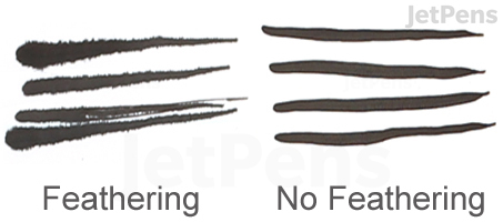
It isn’t PERFECT paper for fountain pens, and my first attempt with Pilot Iroshizuku Asa-gao in the Fine nib of my Narwhal Schuylkill Porpita Navy did produce a hint of feathering, but it’s far from terrible either. I’d go as far as to say I quite liked it. The paper has a strong ivory tint, and I suspect the nature of the paper would preclude any sheen, though I’m hopeful of shading. We’ll see.
Source: Cult Pens – Narwhal Schuylkill Porpita Navy (Mine has much more chatoyance).
The paper’s quite thick, but even the pre-printed prompts have a touch of ghosting, so I wasn’t expecting great things from fountain pen ink. Not bad though. Not bad at all. I’m sure as I work through the prompts, I’ll find some ink/nib combinations work better than others, as is true on most papers. And the primary reason for purchasing it was actually the prompts to creativity… the opportunity for fountain pen use was just a (huge) bonus. The binding is interesting, attached only to the back of the book (“open bound”) and allowing the pages to open completely flat.
I can see this book being a useful kick-start for those moments when I’m staring, pen in hand, at a blank page begging to be filled with words, thoughts and above all else… ink! At my good wife’s suggestion, I opened the book randomly for my first exercise, resisting my tendency to work methodically through each prompt in order. Having freed myself from the need to work sequentially, I felt equally liberated from starting with the prompts offered on the first pages I opened at. Eventually, I settled on Name something you wish was “glow in the dark.” I offer you the results of my warped mind, more as proof I responded to the prompt than anything else:
It occurs to me that the world might be slightly more sanitary if animal poo, and dog poo in particular, was glow in the dark. Though by no means a fool-proof solution, it would at least reduce the frequency of stepping in something unsavoury whilst perambulating after sunset.
As for naming it though… that seems an odd request. I thought long and hard. My friend has a Russian girlfriend called Yulia – like “Julia”, but more exotic. By extension, I assume there are Yuliettes too. So, I therefore suggest to name this proposed glow in the dark item “Yuliette L. Shit”.
So, a very good friend once bought me some “dipping pen” nibs. You know – the type you put on the end of a wooden or plastic holder, dip in ink, and write with sumptuous copperplate or italic majesty.
I was particularly impressed by the thoughtfulness to source so-called “left-oblique” italic nibs to cater for my sinistrality. Mitchell, a UK manufacturer cater for we cack-handed folks.
Like many others before me, I quickly discovered that the nib itself is merely a tool, and the tool at the other end of the handle needs to practice significantly more than most are prepared to! Over the intervening years I have learnt much, such as…
That the nibs themselves often come with a rust-resisting waxy lacquer on them, when new. If you don’t remove this, then the nib surface remains hydrophobic… resisting water-based inks (like 99% of what you’ll probably try to use). This means the nib won’t be able to hold much ink and as a writer you’ll be frustrated, re-dipping your nib every letter or two. Hardly practical or enjoyable.
That there are many suggestions of how to prepare the nib by removing this lacquer. These range from simply sucking it for a minute to let your saliva dissolve the lacquer, dropping it in recently boiled water for a while (scientifically flexible duration), sticking it in a potato for a 30 seconds or so, or even passing it through a match flame a couple of times. (I don’t recommend this myself – see below). Personally, I always let my new nibs sit for a while and a half in rubbing alcohol. Any alcohol will do, though I don’t recommend your dad’s best single malt. it’s just a solvent for the wax. Acetone (nail varnish remover) will do too.
That the nibs are actually intended to be disposable. Professional calligraphers who make a living from wedding stationary often discard a nib after only 100 or so “pieces”. Say 30 invitations with address and return address. They’re typically made from relatively low quality steel and the “pointed nib” variety can be easily bent or damaged. Say by heating them in an open flame…
That there are more kinds of paper than there are shops selling them. Lovely-looking papers can unexpectedly be abysmal to write on with a dip pen. In photography, a technically good photo is a result of balancing exposure, aperture and film/sensor sensitivity. All three need to be in equilibrium. With writing the equivalent trio of influences is paper, ink, nib. With the appropriate nib and ink you can write on pretty much any surface. However, for any given ink/nib combination, by implication – only some papers will give good results. Beginners will do better with shiny papers – they allow the nib to glide more and tend not to “feather” as much (allow the ink to spread away from the written line along the paper fibres). A less pointy nib will not be so scratchy and therefore not be so unfamiliar. Once some basic confidence has been established there’s nothing stopping one pushing these parameters to find what really excites you.
The biggest learning for me though was that amongst the huge plethora of nib styles there are a family with rounded ends. Not “tipped” like a fountain pen nib, which is smooth and rounded in 3 dimensions, but smooth enough to stop most clumsy beginners from skewering paper. Find one that can hold a reasonable amount of ink (in my case a Speedball B5½), and you can write just as easily as with a fountain pen, but with the advantage that you can swap ink colours in seconds. Sure, fountain pens are always going to have the edge when it comes to ink capacity (that WAS their reason for being developed), but swapping inks is definitely fun!
So here was a writing tool that I could play with, without worrying about becoming an expert at Spencerian calligraphy. I could just write normal letter, envelopes and stuff but with inks I wouldn’t want anywhere near my fountain pens. Not that they’re particularly rare or valuable, but I still have a soft spot for them. I don’t feel comfortable putting iron gall inks in my fountain pens for example, even though they CLAIM to be fountain pen safe. They can be pretty cool though and are waterproof – particularly good for those international envelopes. In fact… any envelope from BC’s “wet coast” can benefit from having its address written in waterproof ink.
Mid December, I ordered a few new nibs to expand my options and try some new things. I placed one order with Blots Pens in Northern Ireland, UK. I’m still waiting for that, but it’s only been 5 weeks, and Christmas got in the way. I know from a family member working at the Royal Mail that they were told not to even handle second class post, so they were plainly snowed under over the holidays.
The second order was from John Neal Books in North Carolina, US. That was ordered on 17th December and turned up today. The nibs were very well packed in an envelope inside a foam-lined box. Potentially previously used for jewellery. Very fancy. Relishing “the unboxing” I noted some odd though ultimately unimportant things…
Firstly the packing slip mentioned a “Commercial Catalogue” as it was a first order on my part. Zero value for the purposes of customs, but apparently weighing 0.1875lb. Pretty specific. And also not present. (Probably cheaper for me that way… could be tempting!)
Next, I noticed that the country of origin for one of the nibs (Leonardt #30 Drawing Nib) was written in by hand. Not odd in and of itself – perhaps it wasn’t known when the packing slip was printed. However, what was odd was that it said “Germany”. Despite its admittedly Germanic sound, Leonardt is a sub-brand of Manuscript, a well-known British company. To top it off, the nib quite plainly says “England” on it in block capitals (Birmingham likely wouldn’t fit)! OK, so I freely admit that this is very anal of me, but this is one of only a handful of calligraphy specialist dealers in North America. Surely they should know more about the brands they carry…
Finally, I was pleasantly surprised to see that whoever had packed the nibs in their neat little manilla envelope had crossed their 7 in the continental style. (Plainly I’ve read far too many Sir A.C. Doyle books in my time!)
I was eventually ready to open the little envelope and look at my new acquisitions:
A bevy of nibs
I was a little too liberal with my purchases (a large glass of Malbec was involved, I recall), and as you can see from the above image two of the nibs are narrower than the others. These were originally intended for mapping and technical drawing and require a narrower nib holder to the usual writing nibs. Oh well: an excuse to buy more writing paraphernalia…
So, from left to right, the nibs are:
Brause 66EF: Also known as the Arrow Nib. You’ll see the cut-outs at the side, and this nib promises a bit more “flex”. Nominally an Extra Fine nib, until you engage that flex. Looking forward to playing with this one.
Brause 511: Another narrow nib, intended for fine hairlines.
Despite being designed for a narrower nib holder, these two nibs do in fact fit – slightly uncomfortably – in both my plastic and wooden Speedball holders.
Hunt 513EF: Extra fine, as you’d expect from the name. Note the large bowl or “globe” as is embossed on the nib. This is to maximise the amount of ink suspended by surface tension and allow longer stretches of writing between re-dips. This is the big brother of the Hunt 512 that I already own. Both are bowled and both have slight tip modifications to reduce snagging on fibrous papers.
Leonardt #30: (Clearly embossed with its country of origin. Just sayin’…). Virtually identical size/shape “blank” to the Hunt 512, though formed slightly differently into final nib. Slightly smaller than the Hunt 513EF above, but roughly the same shape. More of a downward curve in the bowl towards the tip, and no modification in the final half millimetre like in the Hunt nibs. Could be scratchy…
Brause Ornament nib (0.5mm): This is the smallest of the Ornament range. It has a tip modification to offer a smooth round writing tip. In theory this should write similarly to an F fountain pen. It has an under/over reservoir to really maximise the amount of ink the nib can hold onto between re-dips. I bought this to compare to my existing Speedball B5½ nib which nominally has a 0.8636mm nib (Spot the American brand!), and essentially a B line in a western fountain pen nib. A Speedball B6 offers a 0.381mm line (pretty specific there!) which is more at the EF end of the spectrum. Looking forward to finding out.
Brause 76: Universally known as the Rose. Brause worked hard to recreate properties found in vintage nibs, and this is the result. Note the cut-outs again to encourage flex.
So – looking forward to giving them a dip in rubbing alcohol and seeing how they perform. I expect all but the Ornament nib to be challenging, simply because of my lack of experience. Come back later and see how it turned out, and thanks for getting this far!
He got more than me.
Why does she get first choice?
Why wasn’t I invited?
All the best ones have gone.
He’s in my chair.
Nobody ever suggested life was fair.
I got to sleep with a full stomach whilst others couldn’t sleep because theirs were empty.
I did get to meet you.
I got to see your nose crinkle the way it does when you smile.
My very first fountain pen was a plastic bodied Parker 45.
11 year old me thought it was soooo fancy because it had a gold, medium width nib and a stainless steel cap (more properly “Lustraloy”). To this day, it writes with a sublime smoothness, though it has suffered from the slight collapse in the section that stalks the Parker 45 due to the cap’s clutch being a little too aggressive for the plastic section’s softness. Unfortunately my handwriting could never do it justice, but I still love that pen.
My contemporaries at school often had the more modern-looking (late 70’s – all things are relative) Parker 25 with it’s all metal Flighter design.
Parker 25 Flighters (i.e. steel bodies) – unfortunately not a mating pair
Over the years I’ve come to realise that there were in fact many variations on my basic black Parker 45, and amongst them was indeed an all-metal Flighter. There’s also a Flighter with a black plastic end, but my preference had always been for “the full metal jacket”. Today, The Pen Workshop near Aylesbury, UK delivered my dream pen. Paul Baker there kindly listened to my preferences and found the perfect match. He even located a pen with a section that shows minimal caving, and managed to find me one with a fine nib. The cap has the all important “Made in England” imprint and a lack of letter stamps puts it as likely pre-1980. I think I’ll just gaze a bit longer before inking it up.
New Old Parker 25 Flighter, c1980
Pen number two started out as simply an “oh, that looks nice” moment whilst perusing for the Parker. It has a gorgeous green marbling which I ultimately found irresistible. Never having heard of the Wyvern brand previously, I did a bit of research and discovered that my parents actually used these Wyvern Perfect Pen Nº 81’s back at high school in the early ’50s, and so with little more than that connection and a desire to own a small bit of British pen history, I added it to my shopping cart at www.penworkshop.co.uk.
Wyvern is long gone now, closing its factory in 1955. Founded in Leicester, the Wyvern Pen Company was named after the mythical creature that appeared in the crest of the borough. According to Wikipedia:
A white (Argent) wyvern formed the crest of the Borough of Leicester as recorded at the heraldic visitation of Leicestershire in 1619: “A wyvern sans legs argent strewed with wounds gules, wings expanded ermine.”
Production of pens began back in the 1890s and Wyvern made several models as well as manufacturing nibs for other pen companies and promotional pens for a variety of campaigns.
The barrel still has the faint imprint of “WYVERN Perfect Pen Nº 81” despite its ~70 year age. I hope I look this good when I’m that old!
It’s widely accepted that the quick brown fox jumps over the lazy dog. But what compels it to do so? It must surely be true since it’s been recorded countless times in countless hands. It was recorded in The Boston Journal, in an article titled “Current Notes” on 9th February 1885, so it’s been going on at least that long! And it’s present tense, so presumably it does so on a continuous basis.
And what of the dog? Why does it put up with such behaviour? I’d get pretty narked if some feral Reynard kept using me as a hurdle whilst I was trying to get some well-earned Zeds after a hard day staring up a tree looking for squirrels. It just seems so rude.
Why oh why?!
The famous phrase is of course a pangram – a sentence using every letter of the alphabet at least once. In my younger years I recorded instead that a quick sly fox jumped over the lazy brown dog. It’s not however the most efficient sentence to record every letter in a gramatically correct sentence. According to the mighty Wikipedia several relatively well known alternatives are ranked thus:
“Waltz, bad nymph, for quick jigs vex.” (28 letters)
“Jived fox nymph grabs quick waltz.” (28 letters)
“Glib jocks quiz nymph to vex dwarf.” (28 letters)
“Sphinx of black quartz, judge my vow.” (29 letters)
“The five boxing wizards jump quickly.” (31 letters)
“Jackdaws love my big sphinx of quartz.” (31 letters)
“Pack my box with five dozen liquor jugs.” (32 letters)
“The quick brown fox jumps over a lazy dog” coming in at 33 letters and slightly more efficient than the usual the dog version.
There has not (as yet) been discovered a “perfect pangram” containing only 26 letters and containing no abbreviations or other non-words, such as “Mr Jock, TV quiz PhD, bags few lynx”.
The steady tap of the door banging on the wall as the wind caught it forced its way into his dreams. Shivering in the early damp air, he pulled the old picnic blanket up to his chin and drew his legs to his chest to try and fend off the cold.
His teeth chattered as he struggled to cough up the night’s bile, and his sullen gaze took in the view outside the glassless window. He’d been glad to find this place as night had fallen. He’d not made as much progress as expected and was still several kilometres shy of the town.
The rain had begun almost as soon as he’d laid out his few belongings to what must originally have been a kitchen floor in the farmhouse. He’d selected this room because it had a stone floor and he could build a small fire without fear of burning down his shelter for the night. He couldn’t risk the fireplace with its chimney and the danger of signalling his presence to others. Best to keep a low profile while so far from help.
He’d found some children’s books in one of the bedrooms as well as a broken cot. They’d made good fire starter and fuel, and he’d drifted off to sleep with a hot drink inside him. He made a mental note to keep a lookout for more tea bags. His last one was barely even discolouring the water now, it had been used so often.
Staying in the shadows, he cautiously stood up and looked more methodically at the road and fields through the shattered window. As he’d expected, there was nothing. No movement at all. As the short night’s rest fell from his mind, he became aware of three things in no particular order.
He was hungry. A cup of hot near-tea was all he’d had in 36 hours.
He desperately needed to let it out too – a full bladder affected his thinking
But there was something else. Not quite as clearly defined. Just an unease. What?
He forced himself to scan the view again. This time in the opposite direction to impose a more careful processing of what he saw. Nothing. Nothing moved. The lack of ease was now palpable though. He slowly slunk back from the window’s edge and bundled his blanket and other items back into his backpack. Another note for the future – look for a bag a little less conspicuous than his current neon pink Hello Kitty one. Still, it did the job, and its plastic shell kept his few possessions dry.
What? What was wrong? He’d lived as long as he had by trusting his guts when they told him danger was close. The door had stopped banging in the wind and the air was now quite still. That was it – there was no sound! Out in the countryside, early in the morning, the air should be alive with birdsong. It was silent, as if holding its breath in anticipation of the next chess move.
Pulling on his mis-matched hiking boots and tucking the laces inside to save having to lace them up, he eased himself back to the window. This time to the opposite side so he could see the angles hidden to his previous position. There! He just caught the faintest trace of cigarette smoke rising in the now-still air and drifting away on what was left of the breeze.
They’d found him. He knew there would be at least two others. All armed. This was the only building for half a kilometre. If they were here, they surely knew exactly where he was.
As he eased back into the shadow, he became vaguely aware that his legs were buckling under him. As the high velocity bullet exited the back of his head, his body bounced a little as it hit the flag stoned floor of the kitchen.


