Jean Genius (with apologies to Bowie)

6 02 2023

So, previous readers may recall my latest obession – paper making. It’s also well covered in my recent reading history which has been cost-effectively aided by our wonderful local library and its extended reach through the inter-library loan system. Most of the books cover the same ground, with little new to add. Some lean heavily on the history and various methods traditionally used around the world. Others have examples of art using the handmade paper – a lot of which looks like nothing so much as kindergarten projects… but a lot more expensive because of who made them.

One or two books I found helpful though because they emphasised the fact that it’s an experimental “craft”. A bit like baking… follow the recipe to the letter and you’ll get something approximately like the picture. But not exactly. It’ll have a certain je ne sait quoi that you yourself added to the mix. And that’s refreshing. The fact that you’re not trying to exactly replicate the photo, but use it as a spring board to make your own unique paper. Once you accept that, you’re free to mix things up a little and try your own extensions from the basic suggestion.

One book I really enjoyed (to the point I ordered a used copy from Abe Books) is Handmade Paper from Naturals by Diane Flowers (with no hint of irony!) Ms Flowers makes the obvious connection between handmade paper and the traditional European source of paper pulp… old cotton rags. She credits one Patty Cox with the original recipe, but essentially she suggests the genius move of beefing up the usual pulp made from old recycled paper (receipts, envelopes (minus the gum and plastic window), letters from the landlord, etc.) with pieces of denim. The cotton fibres in the denim add huge amounts of strength and body to the feeblest of recycled paper (much of which may itself have already been recycled, weakening its fibres).

So here’s my own learnings and experimental results…

I began with an old pair of jeans. I’d been steadily cutting lengths off the legs for use in bookbinding projects. Given I was going to be pulping the fabric for this, I began with the least useful parts for anything else. It was pretty therapeutic to use a stitch-ripper to undo the waistband and undo all the fold-over hems. I aimed for about an A4/letter sheet of paper’s worth of area, though obviously it wasn’t in sheet form. Naturally, I removed rivets and any card or leather stiffeners (yes – I seam-ripped the belt loops to use the fabric from them too… waste not, want not!)

Next, I used some sharp tailor’s scissors to cut up the denim into roughly 1cm squares. I didn’t want to damage the blender, and didn’t want any long threads that might wrap around the blades and cause the motor to stall. I put the small pieces in a bowl and covered them with water to soak over night. I’m not sure how necessary this is, but I figured it might soften up the threads and make shredding easier.

1cm squares of denim plus recycled paper being soaked overnight to liberate any inks or dyes and to soften up the fabric

As per the book recipe, I then prepared about 5 sheets worth of recycled paper and added that to the water to soak with the denim. The general consensus is to tear recycled paper into ~2″ squares prior to blending so as not to unduly shorten the fibres in the paper prior to the blending operation. However, I’ve more recently taken to using a home office shredder to prepare the “stock” paper, and given the punishment the blades of a typical home blender mete out to the pulp, I don’t think this step is as key as one might think… at least for recycled paper. I can see it being much more important for prepared “virgin” pulp such as cotton linter or abaca.

I hadn’t done this pre-soaking previously, and I must say, it works well to release any dyes or other ink in the recycled paper. You can drain it off before adding the wet paper/denim to fresh water in the blender. I typically add 1 litre (a Mason jar’s worth) of water to the blender first, and then add about a fistfull of paper (and in this case – denim). I begin on slow speed then ramp up to full-on ludicrous speed for as long as it takes to make smooth pulp. Again – personal preference for smooth vs. chunky and a note that very smooth equals shorter fibres (and weaker paper generally +/- sizing).

What I got was a little unexpected. The resulting pulp was smooth enough… but a little clumpy. Odd. No un-blended paper or “unprocessed lumps” as such (the very occasional small piece of denim is actually quite attractive if one or two survive the blending operation, but there shouldn’t be many.) But there were definite clumps to the pulp. Almost stringy, like the unspeakable horrors that can clog up a shower drain if one or more members of your family have long hair and enjoy the over-use of hair products.

This is actually the result of the cotton fibres in the now thoroughly macerated and masticated fabric. The fibres are no longer even threads – none of which was more than 1cm long anyway. Now they are individual fibres which slip and slide together within the paper pulp to make longer gloopy threads… which of course is how cotton thread is made in the first place by spinning. This is why it is necessary to be careful to listen to the blender motor and stop it immediately if you hear it straining – the gloopy thread-like pulp can wind around the blades and choke the motor, causing it to over-heat and potentially become damaged. Then you’ll be in trouble with the head chef!

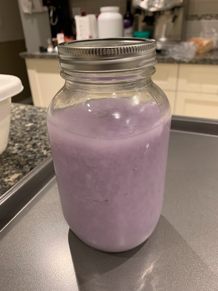
I continued this procedure – one litre at a time – until I’d processed all the paper/denim – I think it came to about 7 Mason jars of pulp in the end. Time had marched on though, so I put them in the fridge until I had time to make paper with them.

Several Mason jars of pulp prepared from denim/recycled paper

The pulp had gorgeous swirls of indigo blue with white, so I had no expectation of being able to write on the resulting paper. This was “experiment one” so I didn’t bother adding any sizing at all, though if I were to make it again (I did make a second batch, but more on that later) I’d add sizing and press it smooth so it’s less fabric like when complete.

The gorgeous swirls of individual fibres of cotton and paper in suspension

I got my 30 litre vat ready on a tressle table in the garage (I’ve been formally banned from the kitchen now… “things go missing”, I’ve been told), and added the Mason jars of pulp. The batch-to-batch variation in colour was quite remarkable due to the random ratio of indigo-laden denim to recycled off-white paper in each jar. If I were to add sizing, this would be when I’d do it, before I add the water. At this point, the water present is just that used to make the pulp with, and the sizing would be left to soak into the fibres before adding more water to the vat.

I finally tracked down some good old-fashioned wallpaper paste (essentially cellulose starch) which should keep me in sizing for years to come (a spoonful per vat should do it), once I eventually burn through my “proper” sizing bought from a papermaking supplier. I’m not sure if wallpaper is no longer de rigeur in Canada, but it was really hard to find, and I’m pretty sure it’s old stock as it is!

Anyway, a gentle swirling of the non-sized pulp mixed the colour more evenly, and the gloopiness was still very much apparent. Next, I added a 5 gallon bucket of hot tap water, and continue to swirl the contents to disperse the pulp evenly. The temperature is not important for the paper making, but since you’re dipping your hands in it for a while, I just find it more comfortable.

Then, I pulled the paper just like with any other pulp… but found it decidely harder to get it to lay evenly on the mould. The clumpiness tends to stop the pulp distributing as evenly as the pulp normally does. I’d say the pulp was too concentrated/thick in the vat, but the situation persisted even as the pulp content dwindled towards the end of the evening. (If this were more of a “production” run rather than experimentation, I’d hold back a couple of litres of pulp to top up the vat after every few sheets, to help keep the “strength” of pulp relatively stable.) Towards the end, I drain off a few litres of water by seiving the vat’s contents and discarding the water onto the garden. That lets me pull one or two more sheets with a shallower vat by increasing the pulp strength.

At the very end, I use the last dregs by pouring over a smaller deckle/mould rather than dipping. Alternatively I could seive it and let it dry as a puck – blending it with the next pulp batch on another day.

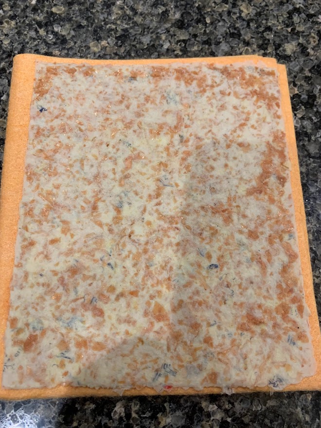
A pulled sheet of paper being added to the post prior to pressing and drying (note the small fabric patch on the left that escaped the blender’s efforts).

I pressed and dried the paper as usual and found it became a lot paler as it dried. It looks fantastic though, and almost looks like fabric rather than paper.

The paper is still noticably blue, but a lot paler as the indigo threads dry out and become subdued by the white paper and cotton fibres.

It is certainly more fibrous than paper made from standard recycled pulp, and a little harder to cut. It makes phenomenal looking envelopes though.

An envelope made with denim paper – deckle edges mostly left, just for effect.

I mentioned a second run. This time I doubled the amount of recycled paper added to the denim, hoping for a less soft/fabric-like result. It’s still drying, so no photos I’m afraid, but visually it looks the same with those amazing swirls of blue and white mixed into the base paper.

I hope you found this of some use or interest. Let me know if you’ve tried something similar and what you learnt.


Punch Drunk

31 01 2023

So a few months ago, I purchased an envelope punch board from that faceless behomoth named after a long river. It’s made in China, as most things are these days, but I have no complaints of its design or build quality.

Image Source: Amazon.ca

Basically, you look up the envelope size you need on the handy dandy table provided, cut a piece of card or stiff paper to the square size required, and punch and score all four sides to make your envelope. My only very minor gripe is that it doesn’t have a built in guillotine for the first part, but most people looking to get an envelope punch would almost certainly already have a paper trimmer. It’s very easy to use and comes with that helpful table for making envelopes in all the standard sizes most “normal” people would need.

Ah… but I’m an ex-programmer, and as any others out there will tell you, the “ex-” is always straining at the leash to be ignored. “Normal” is a very long way outside the Venn diagram we occupy. What if I needed an envelope size that wasn’t on the list? What if I needed an envelope that was thicker than the usual nominally-zero-thickness design? And then (just because I’m an engineer at heart…) what if I already had a piece of square paper… how big an envelope could I make using it?

So I entertained myself (and kept out of Mrs E’s way) for a couple of evenings and came up with an Excel solution with a couple of macros. It allows you to enter a random size for the intended envelope contents (perhaps a card or letter… or some handmade paper for your sister, as a random example) in either cm or (for the one or two countries still using them) inches. It adds a small buffer zone and then calculates the offsets required (in mm as well as old money) by the tool as well as the paper size required to make the envelope.

For shits and giggles I then added a few standard sizes as pre-defined buttons – 4″x6″, A5, A6, 1/2 and 1/4 letter size…

Then I added a third dimension to allow you to add additional score lines for a more box-like envelope for say a dimensional card or a collection of hockey cards (popular in my neck of the woods), or indeed a stack of handmade paper for one’s sister…

Finally I added a feature to allow you to enter the size of an already acquired square (say – origami paper, or a recently retired glossy calendar page), and to calculate the dimensions of an envelope that can be made with no further cutting. I initially used a ratio of 3:4 for the sides of the target envelope, but in the end, decided to go metric and did 1: √2, which is the ratio used by envelopes for standard paper sizes such as A5, A6, etc…

It’s far from perfect, and I’m sure others can easily add other features or tidy up things they don’t like, but if you use an envelope punch board you may find what I’ve done of some small use, and if so – you’re very welcome to use it. As you can see from the screen shot, I didn’t bother too much with tidying up the imperial measurements…

Screenshot of Excel calculator for more flexible punch board options

I realise some may not feel comfortable downloading macro-enabled Excel files from the internet, so I urge you to take sensible precautions before using the file. It was “clean” when uploaded, but all risks are your own, as ever in such situations!

Feedback welcome in the comments section, but please don’t think any feature requests are likely to ever be implemented. Well… unless I think they’re cool/easy!

Excel File for cautious users

(Save to your local disk then either open, enabling macros to press the buttons, or open in the editor to check the code if you’re more cautious – not a bad thing, and I take no offence!)


Pulp Friction

8 12 2022

So my love of fountain pens is already well documented in these pages.

Oh wait – sorry: yes, yes, I’m still alive. Fine, yes, and you? Good, good…

Right, now we’ve got the “where have you been?” re-introductions out of the way, shall we carry on? Well, I am anyway. You are, as ever, free to select your own destiny.

So anyway… fountain pens. Well documented. Hereabouts. Blah, blah.

Fountain pens typically require paper upon which to use them. Admittedly there are those amongst us who collect pens for their esthetics as objets d’art rather than utilitarian items of everyday correspondence, but I’m not one (neither such a collector or, indeed, an objet d’art). I am however a lover of books, the whole amazing concept of public libraries, inter-library loans, and the ability to soak up knowledge in a much richer more visceral way than clicking on Google – though I don’t deny its use or social impact.

A recent foray into the library supplied me with books on letterpress printing and more recently papermaking. Much like the urban tale of kids being asked where milk comes from and replying “the supermarket”, I think many of us have little concept of where the written word comes from. The advent of computers and desktop printers have provided us with instant, selective documentation, and moved us ever further from needing or even wanting to know where such old fashioned items as books or magazines actually come from.

Despite the meteoric rise in Kindle/Kobo readers, streaming news services, and short run digital presses for print on demand books, there is still an incredible amount of good “old fashioned” printing done.

Like the renewed interest in fountain pens, vinyl records, real books and even unpasteurised milk, there is a renewed interest in handmade paper.

And I read some books about it.

And I decided it sounded perfect for a new obsession: it’s messy, straightforward so even a man can do it, you can start small with a few cheap/found items, and did I mention messy?

Not engine oil and spark plugs on the living room carpet messy – more just water everywhere and getting in the way at meal preparation time in the kitchen messy.

There are plenty of online and printed sources so I won’t bore you with too much repetition of “how to…”, just the bits I enjoyed. Considering it’s been around in various forms for a couple of thousand years or more, I think it’s pretty well documented now. As with many such products, it’s been invented countless times in different places in slightly different but essentially similar ways.

Pulp

Paper is made from cellulose fibres that can be derived from many different natural products… even the weeds in your garden. Depending on the source the fibres may be long, short or a mixture. Much of the professional paper making art goes into careful control of the fibres to ensure consistent, useful paper for its given use (anything from tracing paper, kitchen roll, writing paper, newsprint, cardboard, you name it…)

Back in the day, the fibres were made from scratch by cooking, treating with alkali and beating the living daylights out of several types of plant. These days the enthusiast can buy sheets of pre-prepared pulp to skip this time consuming, and frankly spouse-annoying step. Or you can go as far as I did and just use old discarded paper. It’s plainly got suitable paper-making fibres… it’s already paper!

My rule of thumb is to pour a large Mason jar of water into a normal kitchen blender (when Mrs E isn’t watching), and then select a piece of paper about 1.5 times the area of the paper I’m trying to make (or multiple pieces up to the same area). I’ve used old receipts, envelopes, post-it notes, kitchen towel (wet, but not greasy)… pretty much anything.

A few notes:

  • Sugar paper/construction paper is not recommended. The dye in it is cheap and easily released onto pretty much everything you use/touch/think about. Even if you make a half decent sheet of paper… it’ll quickly fade. I’m not saying don’t use it… just be aware of the downsides.
  • If you’re using old envelopes or Post-it notes… discard the gummed part before you begin. They’ll blend up apparently OK, but will leave snotty little balls on your equipment and the dissolved gum can make the paper hard to release from the mould later.
  • Be kind to your blender. Put the water in first. Tear up the paper into smallish pieces and don’t overload the blender. Remove any strings or stables, plastic windows, etc. Also: they’re not paper!
  • Though I haven’t tried it yet, it might be an idea to shred your paper before adding it to the blender.
  • Newspaper ink is often oil based… and will leave a slimy stain on everything you use. There’s a modern move towards soya based inks, but don’t risk it. If you’re using newsprint for your pulp – try and trim off the outer print-free borders. Newsprint uses cheap wood-based paper and will make poor paper… but it’s easy to find and fine for trying things out before you graduate to archive quality museum paper.
  • Laser printed papers – such as many bills (if you’ve not gone electronic) – will work fine, but the print can leave an interesting speckled effect on the finished result. Not good or bad, just be aware.
  • Many other hand-written inks will dissolve away into the water and leave only the paper’s own colour in your pulp.

So – water in first, suitable amount of relatively small pieces of paper. Leave it a while, or swirl it around to soak the paper a bit (you can do this offline before you add it if you’re not as lazy as me). Lid on. Hit go.

Now… remember how I said the fibres can be long or short? The relative amount of those fibres will impact the strength and other features of your paper. If you’re taking this seriously, record what type of papers you blended and for how long. The longer you blend the pulp, the more the blender will chop up the longer fibres. Also the fibres in the starting paper can only get shorter. Newsprint contains a lot of recycled paper fibre that has already been round the game a few times already. The fibres are already short and will tend to make brittle paper if used exclusively. They can be mixed with longer fibres to improve the final pulp though.

Start by pulsing or blending for a few seconds at a time, followed by longer sessions. The aim is to get a smooth, clump-free pulp. Unless you want it for esthetic reasons, you shouldn’t be able to see any identifiable chunks of the original papers. If you used different colours, they should all be blended into a smooth pulp now. If you like, you can now add a small amount of fresh paper and blend for a short period to deliberately add fragments of more identifiable paper – cartoons, crosswords, a different colour, etc.

Depending how impatient you are (or if you’ve been evicted from the kitchen) you can store the pulp in the fridge for about a week. This will slow any mould growth from the now liberated bacteria-friendly fibres. I’ve found the pulp stays in suspension for several days, but if it settles out, just agitate it gently before you use it for making paper.

Pulp from a half sheet of printed computer paper and a 20cm strip of coloured art paper.

Deckle/Mould

A mould is a frame with mesh or fine wires stretched over it – a screen. The gaps are small enough to trap the pulp but let the excess water seep through. A deckle is a simple frame that fits on top of the mould’s screen and provides a boundary beyond which the pulp can’t escape while the water is seeping through the screen. It essentially defines the size of the paper you’re making.

There are a few ways of bringing this about and these are variations on the theme as used in eastern, western and other styles of paper making. In essence though, you can either have a large container of pulp, into which you dip the deckle/mould and extract a deckle’s worth of pulp for the sheet; or you can sit the deckle/mould in a bath of water (so the screen is submerged but the top of the deckle is still clear of the water) and pour a sheet’s worth of pulp onto the screen, then lift the deckle/mould straight up to let the pulp settle on the screen.

Both work, and both have advantages. I’m limited for space and my “vat” is just a small plastic bowl so I use the latter “pour” method for now. I can control exactly how much pulp goes onto the screen, and experiment with paper thicknesses more readily.

A crude deckle/mould made from some offcut wood and a Dollar Store fry splash shield

Pressing

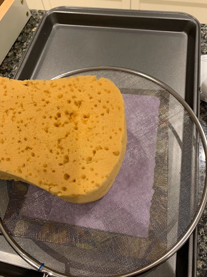
When water has stopped dripping by gravity from the mould, you can encourage further water loss by pressing the top of the new sheet with a sponge or other absorbent item. Gently remove the deckle, then place another screen over the top of the paper, similar to that on the mould (but not attached to anything). I use a Dollar Store frying pan splash guard. It’s a 12″ wire mesh with a convenient handle. Then gently press the paper with a sponge to extract further water. Squeeze and repeat until no more water is being removed.

Sponging some of the water from the top surface. Using a screen to help not disturb the newly formed paper

Then slowly flip the mould over so the newly formed (and still very wet) sheet of paper is on a smooth absorbent cloth, known as a felt… but typically actually wool or synthetic absorbent material. I used Dollar Store super-absorbent stringettes cloths intended for washing cars with. They’re artificial fibres and have a very smooth surface. The paper will take on any texture in the cloths you use for this step, so you can use this to your advantage and deliberately use ribbed cloths or even place thin items such as string between the cloth and the paper to leave an impression on the final product.

Cover with another absorbent cloth, or if you have high hopes of using the paper for writing, use a super smooth surface such as a new plastic sheet (sold in Dollar Stores as a cutting board, but a fraction of a mm in thickness). Then place a couple of other absorbent felts/cloths on top for padding and press the paper. I use a large book to spread the weight evenly, then a couple of 30lb free weights to do the actual pressing.

This step helps the fibres knit and the slow expulsion of water helps the paper form.

How long?! Well… it depends. The paper will not get anywhere near dry at this stage, but overnight will help the paper form strong bonds and be relatively flat.

Ready for pressing on the “felts”

Drying

You can speed things up by simply ironing the wet paper by placing a smooth cloth over it and ironing on a high heat (with no steam!) Quick, but will make weak paper as the bonds don’t have time to form and the resulting paper can tend to curl as the fibres were forced to shrink in the sudden heat.

A better way though, is to press as above, then remove the weight and replace the felts with new dry felts and place a much lighter weight – just the book in my case – and leave for several days to let the fibres naturally dry under mild pressure. This will keep the papers flat, and will retain that smooth surface if you used plastic during the pressing (no longer needed in drying phase).

Sizing

Sizing is the addition of chemicals such as corn starch or gelatin either during pulp making or after the paper is complete in order to make the surface less absorbent and easier to write on. I’ve not tried yet… let me know if you have!

As ever – I’d love to hear your own experiences in the comments below.

Once you get the hang of it – let your imagination fly…


The Papermaker on Vimeo

6 12 2022

OK – three guesses what my latest obsession is?

Fountain pens led to reading up on letterpress which led to papermaking. So far I’ve only made one piece of 5″x7″ paper from recycled paper, but I happened across this video and now Mrs E. is a little worried for my retirement plans…


What the actual?!

25 06 2022

I get it: I’m a guy. I don’t live in the US. It doesn’t impact me directly.

But it does impact me. It impacts everyone when “the land of the free” reduces the rights of its people.

Hopefully sense will prevail eventually… though as I was once taught on a training course “hope is the worst form of plan”. So far, it’s not working well to reduce gun violence in schools.

To quote Peter Gabriel in a song about another regime with draconian laws designed to repress its own citizens: “The eyes of the world are watching now.”

I urge you to be informed then form your own opinion.

Source: Washington Post – funny if it weren’t so tragic.


Polyglots I have known…

13 05 2022

As I sit here in what was once “the play room”, I reflect on how my three wonderful offspring beat several shades of shit out of each other in this very room and in so doing learnt the finer points of tolerance and overcoming sibling rivalry. Politics as we adults call it. We were not smothering parents and largely let them find their own paths through life as long as it was unlikely to involve the Police. All three bear physical scars from some of those lessons (concussions from rugby, leg scars from careless interactions with ice skates, gaps in eyebrows due to childhood face plants), but they are amongst the finest human beings I am privileged to know.

Also – they all speak at least one other language fluently. The middle one speaks at least three in addition to English to my knowledge. Possibly four – not quite sure about the Spanish.

As I type, I can hear Mrs. E. adding Portuguese to her own repertoire via Duolingo in the other room. We joke it is in preparation for our next trip to Madeira. Last time we made do with “thank-you” and “bus-stop”. Paltry fare indeed.

Embracing other cultures and the way they speak to one another is important to the fam jam. We’ve always enjoyed travelling and learning. One of the offspring lives in Montréal, another in Salzburg, Austria, where they both speak fluently in other languages in their everyday lives.

Myself, I have a smattering of schoolboy French and German. I can remember very little of the Latin I studied though it unexpectedly emerges from my hind brain and helps when I’m reading menus in exciting unfamiliar countries. My greatest achievement is learning “thank-you” in a dozen or so countries though. Not much I admit, but it’s better than nothing, and likely more appreciated than fluently conversing about the spot price of fugu and the location of the nearest emergency hospital.

But the point of this posting is the terrible events currently occurring in Ukraine. We “cut the cord” a few months ago and no longer get broadcast TV. It works very well for us (and my wallet), but sometimes I miss the current news and sadly the Canadian news outlets (CBC – looking at you) have largely moved on and barely mention the continuing atrocities being meted out on a sovereign European state. There’s lots of ice hockey being broadcast though – got to get one’s priorities right!

But then we discovered DW (Deutsche Welle) on our Roku, and hit pay-dirt. DW is a German government funded news outlet, but it doesn’t broadcast within Germany. They offer many foreign language programmes, and our particular interest is that they do a daily 25 minute precis of the world’s news in English. It’s produced in Berlin and is Europe-centric though with a global reach. It’s similar in style to the BBC, but unlike the BBC is readily available without fees from here in Canada via our lovely Roku. Their web site even offers German language courses for free.

And the polyglots? Ah – that is the real point of my posting. Here is a German government-funded news outlet, typically hosted by American or occasionally English talking heads interviewing people from all over the world (currently about Ukraine and EU politics, gas pipelines, etc.) in English. And these interviewees all speak flawless English, frequently with complex idioms and quirky turns of phrase illustrating complete comfort with the language. Some are professional journalists or national politicians who no doubt often present in English, but others are academics, analysts or simply people impacted by the events being discussed.

I realise they would only invite people with good English skills, given the medium, but I am humbled by the number of languages many people have at their command. It is so sad that many English-speakers don’t see the need or attraction in learning other languages. There is a theory that THINKING in another language can open you up to new ideas, as your brain strings thoughts together in a slightly different way. Intriguing concept.

I am far too impatient to formally learn another language (a common excuse I’m sure), but I am grateful for the basic command I have of French and German, and am totally open to carrying around a phrase book and stumbling my way through interactions in foreign countries rather than simply “talking louder in English” until I get what I want. Saying thank-you isn’t much, but whenever I go somewhere new, it is the first thing I acquire – before even leaving the airport.

So, with that said, I’m off to see what Brent Goff has to tell me tonight, and no doubt be humbled once more by someone speaking better English than me with a slight accent.


The good and the bad… but at least they’re not ugly.

19 02 2022

Late in 2021 my family asked – as is traditional at that time of year – what I’d like for Christmas. Christmas fills 50% of the occasions (my birthday being the other) that I’m allowed to ask for pens and not cause a reflex reaction of an eyebrow (or two) being raised in some small degree of apoplexy.

It’s well known that I have “a thing” for pens in matte black – ideally with all black furniture and a black nib too. They’re colloquially called “stealth” style… or as Mrs E. calls them “oh, I see you’ve got another black pen to go with all the others”. But they are all different in their ways, as we shall see if you care to peruse further, dear reader….

So, mid-February, and Cult Pens in the UK finally received the stock to fulfill the orders they’d pre-sold in December and shipped on to the eagerly waiting QE here in Canada. I received a pair of “stealth” pens that are very different from each other indeed.

First up is a Parker IM from their achromatic range… the matte black option of course. I’ve got a soft spot for Parker, even though they are a very different company under Newell Rubbermaid. Gone are the days of elegant understated quality, and in are the money grabbing margin junkies that have bought out (or even relaunched) some of the great marques of the fountain pen world.

The neat box that the pen comes in displays the royal warrant emblems showing that both Queenie and Chaz are users of their wares, but then I recall Rentokill also displays the same, so it’s no big deal in and of itself.

Royal warrants – Parker IM packaging

Turning the box around, and I’m shocked to discover that the IM is manufactured in China, and not, as I’d naïvely assumed, Nantes, France (long gone are the Newhaven days)! I read on the great Parker history resource ParkerPens.net that production largely moved to Shanghai when the Newhaven factory closed in 2010.

Global supply chains

Now, please don’t get me wrong – I have nothing inherently against items manufactured in China: it was merely unexpected. Many western brands have either moved their manufacturing operations to China or have contracted companies already established there to provide manufacturing for them. Either sub-assemblies or entire products. Indeed my own employer, a well known American brand, produces high quality, high complexity technology, supplied to an international market, and makes it in a plant in Shanghai.

There is nothing inherently poor quality in either materials or fabrication merely because an item is manufactured in China. But the opportunity is undeniably there if a company is looking to shave some money out of the cost and increase its margins. But let us continue…

The achromatic IM was a gift suggestion, based on little other than the fact it was all black and made by Parker. I was pretty confident that it would be a middle of the road “office pen”, nothing fancy, but a good solid offering from a favourite vendor. Opening the box, I was neither shocked or amazed. It was totally adequate, secure and fuss-free – so far exactly as anticipated. Having been caught out on previous occasions, I took the precaution of lifting the bed that the pen rested on and found the anticipated proprietary Parker blue cartridge hidden there.

Initial impressions were good. The pen is – as advertised – achromatic, with a matte black finish to the metal cap and barrel and slightly more glossy black furniture. There’s a flat finial on the barrel, and a slightly domed one over the clip, which whilst being unmistakably “Parker” feels a little cheap and is a stamped arrow on a folded metal clip. It seems functional though, and there are no sharp edges to snag your clothes if you do use the clip to secure the pen.

The cap rim is also more glossy metal and is stamped with two rings and the Parker logo and name. In addition there is the manufacture-date stamp; in this case “UII”. This translates to 2021, Q2, I believe.

No longer able to contain my inquisitiveness, I popped off the plastic-lined cap, which is secure and shows no play, and found the section and nib to be a little smaller than anticipated. The nib’s quite wide at the shoulder, and the feed is broader than 5mm, but it’s generally in that #5 size range so common in smaller pens. The section is smooth plastic, but comfortable to hold and not overly slippy. It is bookended by black steel bands at both the barrel join and the nib collar, continuing the rather tasteful muted black on black design. Overall – a handsome, smallish pen. Cult Pens gives its dimensions as 137mm long capped, 117mm uncapped, 152mm posted. 12mm wide, 9.5mm at grip… and I have no reason to doubt their measurements.

Parker IM – the business end

I then unscrewed the section from the barrel. And here things began to descend a little…

This is far from a premium pen – I believe the selling price was ~CA$80 – but not cheap either. It’s only a few dollars less than the ubiquitous TWSBI Diamond 580ALR can be had for, and that’s a well regarded piston filler. However, I was utterly horrified to discover that Parker don’t supply a converter with the IM. Given that they have a proprietary size which forces you to buy their own converter at an additional cost, this felt like a simple money grab. Why not just add a few dollars to the asking price and include it? Needless to say, I’ll be syringe-filling old cartridges until I inevitably finally cave and shell out for a Parker converter at some future point.

The plastic of the section continues up to form the threaded collar for the cartridge/unsupplied converter and though there’s no external sign on the smooth section, there are clear seams on the threads and collar. I’m not sure if I’m annoyed at the lack of quality to the finish, or impressed that they seem to have completely avoided them on the visible external parts of the section.

Oddly – I’m reminded of the last house I owned in the UK. It was built in the 1930s, and when we had some rewiring done, it involved lifting up the kitchen floorboards. Underneath, where nobody would reasonably ever be expected to see, was some beautiful lattice brickwork to support the tiled area above that would originally have supported a heavy Aga-style stove. This oozed quality to me because it showed just as much attention to detail in the hidden areas where nobody would ever check, as it did in the visible areas.

Here I got the opposite vibe – this smacked of cut corners and penny pinching. The smooth section showed the technical capability to remove all manufacturing blemishes, the seamed threads demonstrated a lack of willingness to do so. Much worse though – these plastic threads screw into the metal threads of the barrel, and already there is an accumulation of white swarf from the wear on the soft plastic from the unscrewing/re-screwing of the barrel. So far, the joint remains firm and slop-free. I hope it remains so.

At the end of the day, this is not a bad pen, and it writes perfectly adequately. But it’s just not that good either! For an order of magnitude less money I have acquired the similarly styled Jinhao 95 – with frankly better build quality.

Jinhao 95: image from Amazon.ca

And also (I did tell you I had more than a few “stealth” pens!) the Jinhao 85, with a suspiciously similar Parker-esque clip.

Jinhao 85: Image source AliExpress

Then there’s the Hong Dian 517D. These are all in the ~$10 range if you buy directly from Chinese vendors such as on AliExpress and I would argue demonstrate at least as good build quality. They’re all-metal construction, come with international standard converters and nibs that are definitely on par with that offered by Parker in its IM.

Hong Dian 517D: image source AliExpress

To be clear – these are all Chinese manufactured pens (I didn’t include my Lamy Studio LX which is more expensive)… and they’re better than the Parker. So it has nothing to do with manufacturing location or manufacturing capability. In my view, at the price point Parker is commanding for the IM, it should be able to offer a much higher level of experience, whether that is as simple as including a converter or using better nibs. I am sad to say that in my view, the achromatic IM simply is just an “also ran”.

So let’s move on to something good…

A while back I treated myself to a Narwhal Schuylkill Fountain Pen in Porpita Navy. Supposedly a limited edition, but they still seem to be available. It was my first piston filler and I fell in love. I now own a few, and I love the sheer volume of ink those pens can hold. When I saw Narwhal were introducing a range of ebonite pens of a somewhat chonky girth – the Nautilus – I asked for one for Christmas. There are now several options, but initially there were two all-black models with matte black or antique brass finish. I selected the black-on-black option – the Cephalopod. (All their pen models reference sea creatures). Though I’ve enjoyed my Schuylkill, I found its F nib a little too fine for my taste and selected a medium this time around. And I love everything about it.

It’s a sizeable pen, for sure, but the ebonite is surprisingly light, without feeling flimsy or cheap. It really evokes those vintage pens from the early days of fountain pen design. The whole pen is polished to a high gloss, and it’s difficult to imagine this early plastic is essentially the same material as a car tyre!

Narwhal Cephalopod (colour photo!)

The general design attempts to evoke a somewhat victorian vibe for the Nautilus, as the name would imply. The ink view is provided by 3 port-holes, trimmed with black metal. This is matched by a similar plain black metal cap clip, a simple metal curved finial on the cap to echo the curved ebonite blind cap on the barrel and finally the metal band separating the barrel from the blind cap.

See that ink slosh around…

The rim of the cap, on the other hand, is highly decorated with wave motifs and the name NARWHAL stamped twice on it.

Decoration on the Cephalopod cap rim

The cap comes off with two full turns, for those of you who care for such details. This reveals a gorgeously decorated #6 nib, complete with the Narwhal logo. On the Cephalopod model, the nib is black, and in my case was a lovely wet writer – a joy to use.

His nibs…

Now this is not a cheap pen in absolute terms (~CA$140)… but I believe it is great value, and punches well over its weight. It arrives in a simple but elegant presentation box with a magnetic closure to the lid. It is made entirely of ebonite, which we know from experience can last 100+ years in a pen, if not overly abused. It is handsome and well-made. The nib unit can be removed for easy cleaning of the innards as well as a thorough cleaning of the nib itself. Should disaster befall the nib, it is easily replaced with any number of alternatives from Narwhal and others.

Now – this pen does not fit the same place in the usage curve as the Parker IM, but of the two, I would most heartily recommend the Narwhal. As my North American friends are wont to say “your mileage may vary”…


Forest Bathing, or shinrin-yoku

6 02 2022

The Japanese figured out, long ago, that simply walking through a forest, with all its sounds, scents, textures and shades of green had a very tangible calming effect on the human spirit. It’s even prescribed by doctors and termed “forest bathing”, or immersing oneself in the totality of nature.

Living in glorious BC, we have countless opportunities of experiencing the forest – typically in its many damp guises of rainforest – especially mossy, quiet and oh so very green!

Yesterday, Mrs E and I took the chance to wander around Derby Reach, near Langley. In the late 1850s it was proposed as the new capital of BC, and a squad of Royal Engineers was dispatched from Britain, via the colony in Victoria, to survey and begin laying out the new capital. Very quickly it was apparent that though the local Fort Langley was prosperous and well placed on the Fraser River for trade – particularly with Hawai’i – Derby Reach was not really suited for anything beyond the low key farmland it has remained ever since. A better location was surveyed in what is now New Westminster (colonists – particularly those of a military mind – are seldom imaginative when it comes to naming places). It is on an easily defensible hill and has many other advantages over the somewhat damp terrain of Derby Reach. Only later did the provincial capital revert to Victoria, on the island.

The woodland at Derby Reach is still bounded by a mixture of boggy land and farms, and is one of many regional parks in Super, Natural, British Columbia.


No Grime or Raisin

30 01 2022

I’ve been trying to use and more greatly appreciate my current fleet of fountain pens and ink, and resist buying many more this year. We’ll see how that goes…

I had ordered a couple of pens from ēnsso in California at the end of 2021, and both have now safely arrived. I blogged my initial thoughts on the diminutive XS Minimalist previously here if you’re at all interested.

A couple of weeks in, I’ve written dry the initial Kaweco Smokey Grey ink cartridge I’d christened it with. Such a lovely pencil-like neutral grey. Looking forward to finishing the packet of cartridges I bought and moving on to a full bottle (when I allow myself to buy ink again… ).

In the end though, I just couldn’t get on with the Bock M nib I’d ordered with the pen. I wasn’t sure if it was the ink or the PVD coating on the nib, but it was highly prone to hard starts/skipping at the beginning of words. I was pretty sure it was the nib, as the ink is quite wet usually and provides lovely shading as it pools in the letter forms.

The business end of the nib – the underside of the tipping – doesn’t actually have PVD on it (I guess it quickly gets worn off in use – paper can be surprisingly abrasive), but I suspected the coating on the tines was messing with the capillary action and so I swapped the nib unit out for a spare uncoated B Kaweco nib unit I had, and it wrote flawlessly from that point on (no pun intended).

To be fair – the Bock on the ēnsso comes with a very different feed to the Kaweco-supplied unit, so that is one variable I didn’t exclude from my perfunctory testing.

Coated No 5 Bock nib on ēnsso XS

This last week brought me two more toys though. Firstly was my long-awaited limited edition (200 units – 3 left at time of writing) ēnsso Italia, made from raw copper. I’ve long yearned for a pure copper pen: I’ve enjoyed the look of copper patina since I first became aware of the extreme blue copper salts found on old rooves* back in the UK. Pens tend to only gather varied shades of darker brown salts, but the almost organic nature of the staining is something I find attractive. All that said… I was actually a little disappointed to find that my brand new pen already had some smears and marks on it. OK – maybe not grimy as such, and they will be readily subsumed into the naturally acquired patina as time moves irresistibly forward, but I was just a little sad it didn’t at least start pristine.

ēnsso Italia LE in copper – note oxidation on cap

It’s generally though a thing of beauty. It’s pretty weighty at around 86g with the cap and 55g without. It is machined out of a solid block of copper with the exception of the spring steel clip which is neat, unadorned, functionally efficient and without any nasty sharp edges.

The cap and barrel have tiny micro-machining rings from the lathing, and if you rub your finger lightly along the length of the pen you can hear a slight susurration or singing, though you can’t actually feel any ridges, they’re that fine. Holding the pen to the light gives the telltale rainbow along the reflection highlights, showing micro-scale differences in the angles of reflection/refraction from the ridges left by the lathe blade.

The nib is a standard No 6 Bock unit, and though it was perfectly adequate, I found the M I’d ordered to be a bit narrow for my taste, and swapped it almost immediately for a spare Jinhao M (as used in their X750), which I’ve always found to be reliable and juicy.

The cap and section both sport the italianate frieze that gives the model its name, and unscrewing the section reveals the only branding on the collar that holds the converter.

Lip of cap, showing Italianate ornamentation
Branding on collar for converter

Both screw connections – cap to barrel and section to barrel – are machined and copper on copper, which can sometimes cause a bit of teeth jarring if you get a false start, but are robust and secure – no slop in these closures. The cap is threaded to the barrel with square cut threads which are not at all uncomfortable when writing, and close the cap in about 1½ turns, for those who care about such things. I can’t say I’ve been rough with the pen thus far, but I’ve not noticed any propensity for the cap to come loose or the section to unscrew with wanton abandon.

Now we come to my one real gripe – and it’s small (literally and figuratively), and to lessen it further, I actually anticipate it will improve with time and use…

Some pre-patina and severe transitions

I’ve been thoroughly impressed with the quality of the machining from this California based outfit. I can’t help feeling though that some of that finesse is lost by not paying a little more attention to the final result. I find the edges of the ornamentation very crisp and clean… so much so that when writing, you can’t help but notice the sharp edges of the ornamentation around the nib end of the section. Similarly the simple Star Wars-esque trench around the end of the barrel. Very stylish to look at, but just a little awkward when explored with one’s fingers. Not sharp enough to cut, but sharp enough of a transition in the surface to be uncomfortable, and likely to snag on delicate fabrics should one be carrying it in a pocket. These are not burrs or poorly finished edges – au contraire: they are such well machined transitions, they are literally razor sharp.

I actually expect, copper being a relatively soft metal, that these sharp edges will dull over time. Perhaps even hurried on their way by those users that will polish the pen regularly to try and maintain its lustre. (Not me! Bring on that patina…)

The pen is limited to an edition of 200 and I’m very glad I managed to get one by pre-ordering. My niggles really are minor and the price was astonishingly reasonable for a hand made pen. As ēnsso continue to mature, I will continue to keep an eye on their future offerings, and certainly appreciate their fresh engineering-led take on the often conservative world of fountain pen design.

So, it’s with more than a little irony that I now turn to classic designs from earlier days of fountain pens.

From the early 1900s through to art deco, it was not uncommon for pen manufacturers to offer users premium versions of their pens clad in sterling silver – often added to the basic underlying pen by a specialist silversmith. There are countless examples from such classic vendors as Waterman, Dunhill and others. The silverwork had several gaps through which the underlying pen was visible, to provide visual contrast – usually simple black hard rubber (ebonite) in those days. But good design causes echoes through time. (Though so too does bad design – looking at you, flared jeans!)

I was recently made aware of a new (at least to me) Chinese pen manufacturer… Asvine. They may or may not be associated with Hong Dian, though I confess my Chinese is not sufficiently advanced to tell. (OK, OK, I admit I can only understand/say “hello”, “I’m fine” and “thank-you”). The V169 model is a vacuum filler, which is a filling method not shared with any of my other pens and I have recently been looking for a low priced option that had received decent reviews… enter exhibit one. I admit it was ordered after 2022 began. What can I say? My abstinence is still a work in progress…

It’s a resin cap and body, covered with a brass sheath styled like a cross between those art deco designs and a 60’s lava lamp. The brass is itself plated chrome, making for an attractive silvery finish. Because of the clear resin one can entertain oneself watching the ink sloshing back and forth within the reservoir, through the many “windows”. The cap has a solid clip with a strong spring – not just the typical folded sheet metal common in cheaper pens. The section is fully metal and mine came with a No 6 M nib, not unlike the wet and smooth nibs I’ve received with several larger Jinhao pens. This is a different nib though, and has the M size marked attractively in italic on it for reference.

Asvine V169 with M nib

I was a little worried that the section might be slippery, but the slight waist-ing of the design seems to avoid this being an issue in practice. Threads are square cut and very smooth to the touch. The cap closes in 2½ turns, which some people seem to care about. The threads are resin (cap) on metal (section) and have a reassuring cinching feel as the cap closes shut. The top half of the cap has a narrower bore and this allows the section to snuggly dock with it and keep the nib from drying out. I chose a smokey grey/blue resin, but there are a couple of other colours out there to suit your mood. At 32g uncapped, 54g capped, it’s a mid weight pen, I’d say.

Branding of “Asvine” is embossed around the cap opening, and there are no uncomfortably sharp transitions even on the many holes of the sheathing.

The blind cap unscrews to become the plunger for the vacuum filler which felt positive and well made.

Along with several other metal pens in the $10+ range I’ve accumulated from China, this pen feels well designed and solidly made. I shall be keeping an eye out for other Asvine products, because if this is anything to go by, we’ll definitely be hearing more in the future.

And as for the reason to discuss raisins…

Yesterday we stopped by at Fieldstone’s bakery on the way home. They do pretty awesome cakes and make bread using traditional ingredients and methods. (i.e. they can be pretty chewy, but taste great.)

As is common in Canada, they offer a lot of sourdough options… something I’d never even heard of until I moved to the colonies, but have come to quite appreciate. Mrs E is not a fan, but was willing to give the raisin and cranberry sourdough Pugliese a try, figuring the sweet/tart fruit would offset her dislike of the vinegary/sourdough taste.

It was with some dismay then to find when we got home that we’d actually been given a garlic version of the loaf! Thankfully we’d been peckish and cut a pre-dinner slice before having committed to it for breakfast toast on Sunday. That would definitely have been an experimental pairing with marmalade!


*

Source Google: More popular now than ever. Don’t go all “you spelt roofs wrong” on me!


Small, but perfectly formed

17 01 2022

No, not Mrs E. – though the same could be said there too.

As copiously documented elsewhere on these pages, I have a thing for matte black pens. I also like unusual designs – well executed engineering, not blinged out monstrosities. I also fall foul of the marketer’s FOMO lure on occasion, but only if the price is not outrageous. Sometimes I’m disappointed (like with my Conklin LE Duraflex demonstrator, (No 200 of 898), which while operating perfectly adequately as a writing instrument is nevertheless a travesty of poor execution, with great globs and smears of glue being visible through the clear plastic).

Back in November as advert from ENSSO in California caught my eye. It was for a limited edition of their ITALIA model, made entirely in Copper. Lovely… sign me up. I’ve had a thing for copper patina ever since seeing the extreme examples on various buildings in the UK.

Only downside was that it wasn’t shipping until January. (I’m glad to report it’s on its way as I type.) Hopefully it won’t languish in the USPS system before getting handed over to Canada Post. There’s a stock photo of it here. But I’m sure you know how these things spiral out of control (you’re reading this page, after all!). You begin by looking at one thing, and end up looking at another. Before you know where you are, you’re looking at a neat looking “stealth” pocket pen for the very reasonable sum of US$35. And then there’s the discount for first time buyers, and well, you know…

Source: ENSSO

So anyway, today the ENSSO XS turned up, and it was not quite what I expected. Not in any bad way, mind – it is certainly full-on stealth… matte black section, barrel and cap. PVD (Physical Vapour Deposition) Bock No 5 medium nib. Nary a photon escaping its surface…

But, well, it’s even smaller than I’d anticipated! When they say XS, they mean it! I guess I’d imagined something similar to an AL Sport. This is a machined Aluminium pen (and very well executed, I might add), and it’s tiny. This is basically the same dimensions as a Kaweco Liliput.

It came in a simple branded cardboard box with the pen, a clip, a single unbranded short cartridge (black of course) and a couple of O-rings. More about those later.

ENSSO XS

The pen is machined into a 12-faceted cylinder, with slight chamfering at the cap/barrel join to avoid any sharp edges. Both ends of the pen have a slight conical finish, perhaps a millimetre in height. The very end of the barrel has the only visible branding of ēnsso, and the entire pen is powder coated black. It feels very even and semi-industrial… perfect!

A closer look at the end of the barrel will reveal a slight recess that holds an O-ring in place… very firmly. Another O-ring is in a similar recess on the section and holds the cap in place through friction. Whether the cap is placed closed over the nib or at the back of the barrel to extend it to a full size pen, it is held surprisingly well in place, and there’s a definite engaged/not engaged transition with remarkably little slop between the two. The inside of the cap has a machined ridge/recess which makes for a very satisfying click whether the cap is being used to cover the nib or extend the barrel.

Time will tell how secure this friction fit remains, but the inclusion of two spare O-rings leaves me confident it’s a distant future me problem.

The box included a clip, and though I don’t feel the need to use it, I was impressed to see that it too was machined with the 12-sided design, and not relying on a circular clip to merely have the vertices of the cap to grip on. Given my usage habits, I do not fear this faceted pen rolling anywhere, nor do I feel the need to clip it to any pocket. Nice to know I could though.

ENSSO XS cap is designed to fit the 12-sided cap or barrel

The business end of the pen is a No 5 Bock steel nib (mine’s a medium), and is PVD coated black to match the aesthetic. The leaping mountain goat looks very sleek in all-black

No 5 PVD black Bock steel nib

The barrel takes a standard short international cartridge (I opted to christen the pen with Kaweco Smokey Grey rather than the no-name black it came with), and is not long enough to take even a Kaweco Sport converter. Nor for that matter is the similarly short Kaweco Liliput.

Comparison of ENSSO XS and Kaweco Liliput

The above photo compares the Liliput to the XS. You can see how the XS has a longer section, but shorter barrel. It is only slightly longer than the fully seated short cartridge, whereas the Liliput could at least theoretically hold a half-filled converter (though there’s little point).

In use, it’s slightly longer than the Liliput, despite being almost identical in dimensions when closed.

Kaweco AL Sport, ENSSO XS, Kaweco Liliput

The XS has the longest section of the three pocket pens I compared. In most other regards it’s similar to the Liliput, and I think it will serve as a convenient, unobtrusively carried note-taker rather than a long writing session tool. We’ll see… I’m quite adept at ignoring my most well laid plans.